Tag Archives: art

History of Impressionism

By: Fletcher Pike

Monet’s ‘Water Lilies’ Image via Wikimedia Commons https://commons.wikimedia.org/wiki/File:Claude_Monet_-_Seerosen.jpg

Art comes in several different forms, many of which you have likely seen today. You might think of paintings from the Renaissance period like the ‘Mona Lisa’ or ‘The Girl With The Pearl Earring’, or maybe more abstract, modern paintings. But one art style in particular was formed as a result of one of the most popular movements in art history. That art style would be Impressionism.

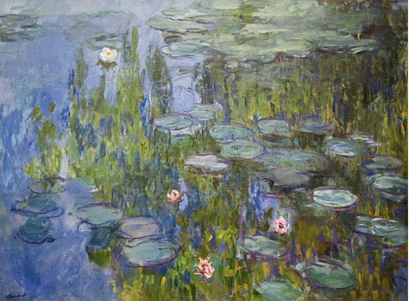
Impressionism itself is a very recognizable style of painting, as the paintings featured bright, chromatic colors rather than the more dull palettes that were used for previous styles of painting. The colors also emphasized the contrast between light and shadows. These paintings very often depicted a mundane or realistic setting, rather than dramaticized historical scenes.

In 1874, a group of artists formed the ‘Anonymous Society of Painters, Sculptors, Printmakers, etc.’. Its founding members included popular artists such as Claude Monet, Camille Pissarro, Edgar Degas, Berthe Morisot, and several others. They created an art installation in Paris, France, where many unique paintings were displayed. 

However, these paintings were a bit different from other paintings at the time. These paintings included loose brush strokes, vivid colors, and featured scenes primarily of nature or the simple, everyday life. These were different from the grand, historical story-based paintings that were made during this time. This new abstract style brought a sense of realism in contrast to the art featured in this time period.

Claude Monet was a significant figure throughout this movement, as he was one of the trailblazers that popularized the style of Impressionism. In one of his exhibits, critic Louis Leroy gave Impressionism its name by stating Monet’s paintings were more of an uncompleted sketch, “an impression”.

The final independent exhibition of Impressionism was held in 1886, but the painters had begun shifting towards a new direction for the movement, which was Neo-Impressionism. This was an art movement characterized by small intricate dots, distinct brushstrokes, and bright colors. 

Though the final exhibition was so long ago, the Impressionist movement had a large impact on the art community by adapting to new art styles, and allowed artists to freely express themselves through their artwork.

For more information, please visit:

THE LAST FEELINGS

By: Christine Yang

Artist statement:

This artwork was made especially for a Personal Project. The artwork was created with the use of oil pastels, which I really enjoyed using and took me about 10 hours to finish.

I was really inspired by an oil paint artwork, “The Starry Night” by Vincent Van Gogh.

Even though I really want others to have their own interpretation of it, but for me, it’s about how a person you loved but they’re not in your life anymore, so you replay moments with them which makes you want to crave their presence. As you wait for them to return back into your life again, they’re slowly moving on, like fading away.

Drawing of bird

By: Pwe Doh Gay

This is a picture of a bird/woodpecker I made. I made the woodpecker because I wanted to draw something different and cool. Also, I drew it because there are lots of birds in the world, and I saw one outside a window and wanted to draw one.

In this drawing, I used a pencil to make the bird and tree trunk, then I went over it with an ultra-fine Sharpie. After, I colored in the drawing with markers.

I really like how my first drawing of a bird turned out. My favorite part about the picture is the pecked trunk; I really like how it looks with the bird.

One area I could improve is the color, perhaps by adding more color to the bird. Overall, I think it looks very good.

For my next drawing, I will make a bird or something else that is cool, but it will probably be next school year.

Zentangle 3

By: Pwe Doh Gay

This is a drawing of another zentangle but in a deck of cards style. I really thought that the second zentangle looked really good, so I wanted to make an even better one for the last zentangle drawing.

For this picture, I used a pencil to make the cards and patterns. Then first went over that with an ultra-fine point Sharpie, then with a fine-point Sharpie, to fill in some of the white spots.

I really like how this one turned out. I think this is my favorite one out of all three zentangles I made. I really like how different this one looks from the others. The patterns just look cool inside of the cards. My favorite pattern is the ten of diamond card. The one that I don’t like is the X shape pattern with the dots in it, on the ace card.

For my next drawing, I will make something else, but I don’t know what I will make yet, but I think it will probably be something that will include color.

Zentangle 2

By: Pwe Doh Gay

This is another picture of a zentangle but in a triangle shape. I liked how the other turned out, so I wanted to make another one. Zentangles are just a cool and simple thing to make. You can make any design, and it will look cool.

In this drawing, I first used a pencil to make all the patterns and shapes. Then I went over that with an ultra-fine point Sharpie. I then filled in some of the white spots with a fine-point Sharpie.

I really like how I filled in more of the white spots compared to my first zentangle. It makes the zentangle look a lot better and cooler. In this drawing, I like all the patterns I made; they all looked cool to me.

For my next picture, I don’t know what I will draw, but I will draw something.

Ohuhu alcohol marker review

By: Persephone Pond

Ohuhu is a newer brand that produces all sorts of art supplies, from paints to markers.

Gaining traction in the early 2020s, Ohuhu quickly became popular for their lines of alcohol based markers. This article will be a quick review of all you need to know about these markers, and if they’re worth the money.

Ohuhu alcohol markers come with three choices of tips: chisel, fine, and brush. Each artist has their own preferences on which to use, and each set of markers purchased are double sided, including two of the three tips. My personal favorite is the brush tip doubled with the fine tip, which falls under Ohuhu’s Honolulu B Series. The combination of the brush and fine tips allow for easy coverage of larger areas, yet include the option of a smaller tip to fill in smaller details.

The quality of these markers are incredible. Coverage is smooth and consistent, and the life of these markers is impressively long. In addition to the long lifespan of these markers, Ohuhu also sells ink refills separately for about $5 each. These refills last even longer, and are a good investment if the markers are in use frequently.

The color options include a wide range of neons, grayscale, pastels, and more. With hundreds of colors to choose from, there isn’t a shade you can’t buy. The pressure control of the markers is also a big pro, creating an easy way to shade and blend colors together.

Price wise, Ohuhu markers are a good investment. Packs of markers are sold in wide ranges, from just 48 markers to up to 320 markers. For a pack of 48 colors, the price comes out to $39.99 (before shipping) from the Ohuhu website (but this pricing is consistent across retailers), which is about $1.20 per marker. Each pack comes out to around that same price per marker, which means buying in bulk doesn’t save money.

Overall, Ohuhu alcohol markers are a worthwhile investment, whether you’re a beginner artist, experienced artist, or just trying to learn how to use alcohol markers.

Zentangle

By: Pwe Doh Gay

This is a picture of a zentangle I drew. I made this drawing because when I first saw it, I thought it was cool, so decided to draw a zentangle. Also, a zentangle is an easy thing to make and is supposed to be a relaxing and a fun thing to do. All you have to do is make different shapes and patterns to make a zentangle.

For this drawing, I used a pencil to make all the different patterns, then I went over the pencil with a Sharpie. After I went over with a Sharpie, I colored in some of the white in the patterns to give it a different look.

In this picture, I really like how the different patterns look. The pattern that I like the most is the lines with the shaded background by the triangle one (by the lower right corner). I also like a lot of the others too, but there are one or two I don’t like (like the half triangle pattern near the upper right corner).

For my next drawing, I might make another zentangle but different, or I might make something else.

Football drawing

By: Pwe Doh Gay

This is a drawing of a football. I made the football because lots of people like football and I like sports; I am even on the football team. Football is one of the most famous sports in America.

In this drawing, I used a pencil, then went over with a Sharpie. After that I used markers to color the football in. I put an American flag on the football to tell you that it is American football and not soccer. I also wrote football on it just for fun.

I like how cool the picture turned out because of the American flag on it. The flag makes the football look different. But I don’t like how the stars look because of how close they are together.

For my next drawing, I will draw a cap or something else.

Drawing of a shoe 2

By: Pwe Doh Gay

This is a drawing of an Adidas shoe, also called a Superstar. I drew this shoe because Adidas is the second most popular shoe brand in the world (after Nike). There are a lot of people that wear Adidas shoes in the world, including me.

For this drawing, I used a pencil, then went over the pencil with a Sharpie. After, I used markers to color it in. I also put cross-line designs on the shoe to give it a different look.

I like this shoe a lot because of how it turned out with the cross lines and the two colors on it. This shoe really looks different from the normal ones you can buy from the store.

For my next drawing, I don’t know what I want to draw, but I will draw something.

HOW TO MAKE A FASHION BOOK/TEMPLATE

By: Charlotte Bistodeau

Many people want to get into fashion designing but don’t know where to start. You might think you need fabric, special notebooks, special pencils (which is all true eventually but not in the beginning). Here I’ll take you through some of the simple things that will make getting into fashion design easier overall.

The first thing you’ll want is a fashion book. Any notebook can be a fashion book, but there are many things I’ll suggest here that will make things simple.

  1. I suggest a notebook that has blank pages (think sketch books). Having lines on your paper may distract you from the final product.
  2. When choosing your sketch book you want to think about what art supplies you’re going to use most. Example, If you are going to be using a lot of watercolor then choose a sketchbook with watercolor paper.
  3. Your sketchbook does not have to be fancy, in fact you can purchase one at Five Below and you’ll be fine.
  4. Small sketchbooks are a great starting point especially if you have no clue what to do or design. Less space means less stress on the line and makes it seem like you’ve done more.
  5. A bigger sketchbook might feel like a nice idea (not filling it up as fast, having more room) but it can make you feel threatened by how little you seem to have drawn or how much you still have to draw.
  6. Don’t pick out your sketchbook for ascetic purposes. Just because it looks nice doesn’t mean you’ll like the feel of it. You should check to see if you like the feel of the grain and if it works with the main art supplies you choose to use. If you really are worried about it looking nice, you can always decorate the cover yourself with paint, paper, stickers, etc. and make it your own.

The second thing you might want to do is create a stencil to make it easier to draw your design. So, here are the steps to make a stencil.

First, you’ll want to sketch out a picture of a model template. After you finish your drawing and are happy with it, you should take a photo for a later step.

Second, you’ll want to glue your drawing down on a piece of cardstock or thin flat cardboard. Example, I used a side from a box of ice cream (taken out of recycling).

Third, you’ll want to use an exacto knife or box cutter to cut out the drawing from your template; make sure if you have extra pieces (example, for me it was the gaps between the body and arm) that you find a way to keep them connected to the rest of the stencil. Also make sure to have an extra piece of cardboard, cutting mat, etc, to make sure you don’t scrape whatever surface you’re cutting on.

Now you can take a pencil and trace it. Notice I drew on a lined sheet of paper; I did this as an example and if I am actually going to use the template I’ll draw it on a blank sheet. Going back to the first step, look at the photo you took of the original drawing and add anything you may have missed with just the basic stencil (Red is what I added to make it look better).

Now you have your fashion book and stencil and can start your fashion drawing experience!